The Problem
Insta-Style is losing 70% of potential sales at the crucial transition point between the Shopping Cart and the Final Payment page. Data shows that users frequently fail to proceed past the first step of the checkout process. The problem isn't the aesthetic; it's the flow and cognitive friction in the checkout process.

The above chart clearly shows the huge drop of potential users abandoning their cart.


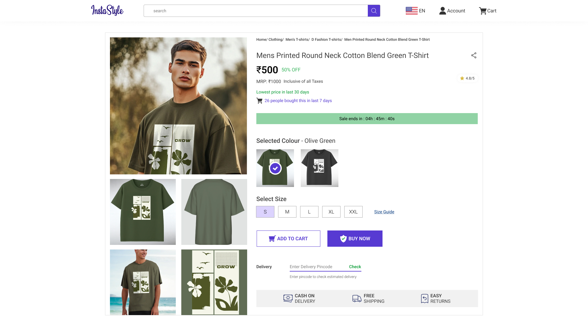
/product screen.webp)
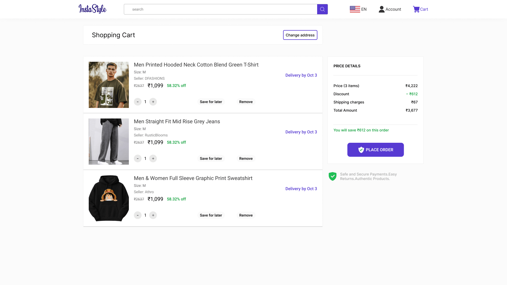
/cart.webp)
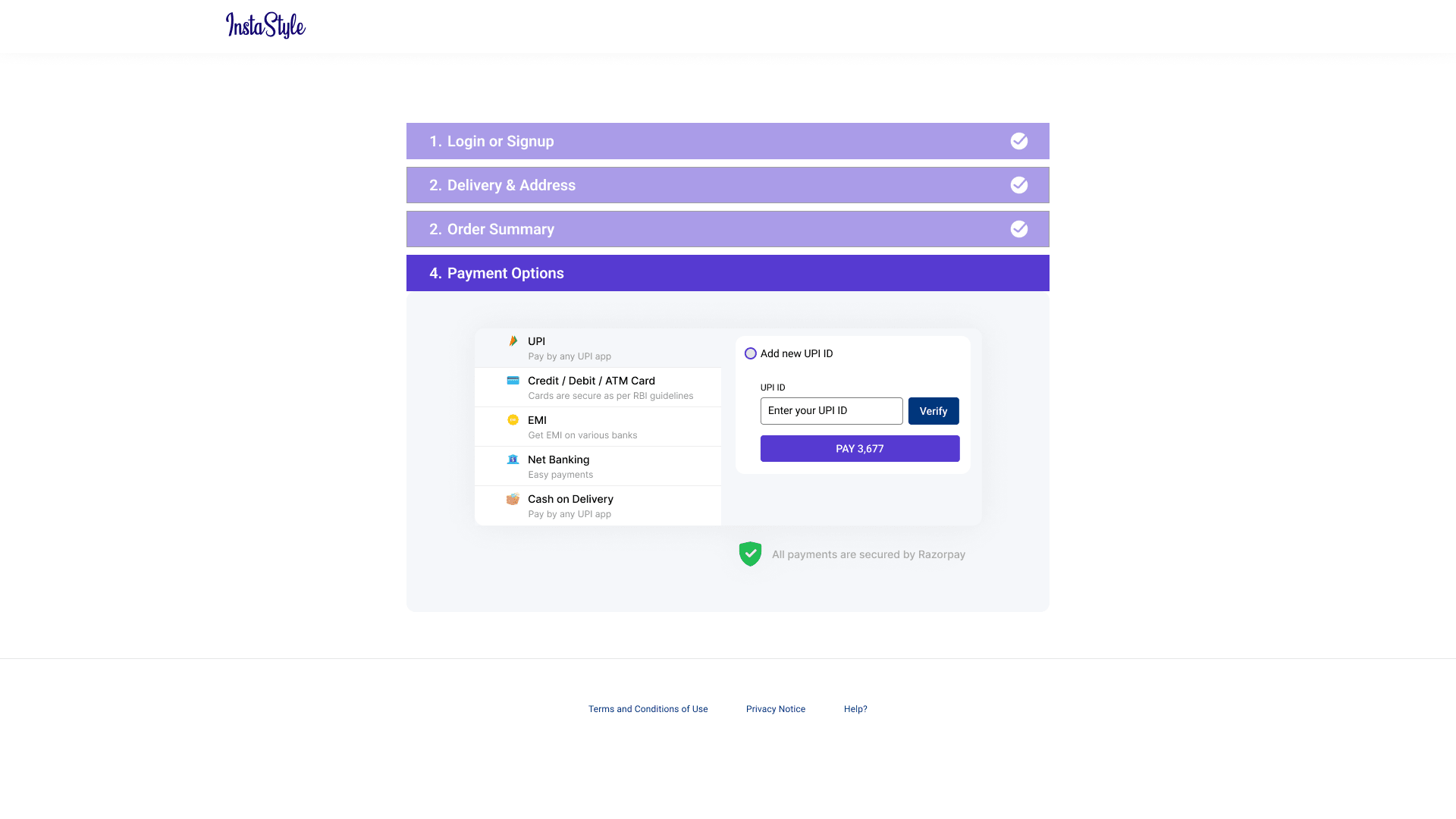
/checkout.webp)